
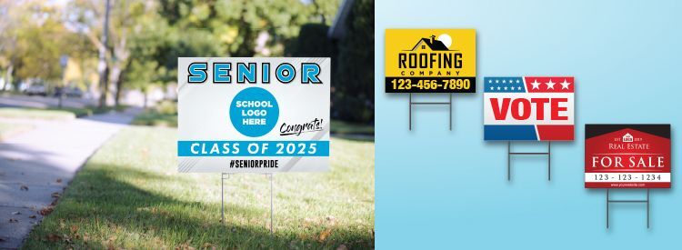
YARD SIGNS - REAL ESTATE, POLITICAL, CONSTRUCTION AND MORE!
Yard signs are an effective way of announcing a home for sale, a garage sale, a new pool going in, a political candidate, a political issue, where to go for an event, or even a graduation or birthday. The most common types of yard signs are ...
- Real Estate Yard Signs
- Political Yard Signs
- Campaign Yard Signs
- Vote-for-Proposition Yard Signs
- Birthday Yard Signs
- Graduation Yard Signs
- Directional Signs
- Garage Sale Yard Signs
- Yard Sale Signs
- Construction Yard Signs
- Pool Build Yard Signs
- Roofing Contractor Yard Signs
- And more!
Tips for an Effective Yard Sign
Yards signs have just two jobs to do:
- Attract Attention
- Deliver Message
What makes the above tricky is that your target audience will be speeding by in vehicles. You want them to read your sign while still paying attention to traffic! For drivers and passengers to get the message, your sign must be readable. Thus it’s important to consider the following tips ...
BREVITY
This is not the time for creative writing. Be brief. Pithy if you can, but definitely brief. Avoid cluttering up your sign with too many ways to contact you. Make it a phone number or website address. Logos are optional. Remember, yard sign space is a premium. Only put what is absolutely necessary on the sign.
VARY SIZE OF FONTS
Use large, medium, and small lettering. For example a political yard sign might have the last name of the candidate in the largest lettering; “VOTE” in medium lettering; and, the candidate's first name or the campaign slogan in small lettering.
BOLD FONTS
If your goal is to attract folks at a distance, you’ll need to ensure your main message is in a very bold font.
EASY-ON-THE-EYES FONTS
Use fonts that are easy to read as opposed to decorative. Commonly used fonts are Arial, Helvetica, and Verdana.
CONTRASTING COLORS
Contrast dark bold lettering by putting it against a light background. Or do the opposite. Contrast light bold lettering by putting it against a dark background; this is known as “reverse type.”
BLANK SPACE
Up to a third of your sign should have no lettering on it. This makes it easier to read.
ONE-SIDED VS. TWO-SIDED SIGNS
Two-sided signs might be fine for your needs. But consider if you’ll get more value with two one-sided signs placed exactly where you need them, rather than trying to place a two-sided sign just right.
One more thing ...
Know what else is good for getting attention? Check out our banners page. We are aces at creating custom banners for every kind of venue or special occasion.